Managing monthly sales isn’t always straightforward. You want to stock up for busy periods without overcommitting in slower months. That’s where simple forecasting models for sales come in, helping you spot patterns, anticipate demand, and make confident decisions.
In fact, experts say “sales forecasting gives you a roadmap for success”, helping you anticipate demand and manage inventory. Fortunately, you don’t need a PhD in statistics to get good forecasts – tools like Excel or Facebook’s Prophet were built so business managers can use them without being data scientists.
In this guide, we’ll explore three simple forecasting models for sales, each with its own style and strengths., each with its own style.
We’ll illustrate each with a chart from our beer sales data. The blue lines in all charts are the actual past sales; the forecast is shown in a different color. You don’t have to master math to use these – just understand what each chart is telling you.
Facebook Prophet (Easy Trend & Seasonality)
The Prophet model (from Facebook) automatically fits trends and seasonality. You just feed it your monthly sales history and it gives a smooth forecast (red dashed line) that follows the ups and downs of past sales.
In the chart below, notice how Prophet’s red forecast line tracks the blue actuals through most of the peaks and dips. This simple forecasting model for sales is popular because it’s user-friendly – it was designed so that business users can run it without deep stats expertise. It even has built-in ways to handle regular events (holidays, big local festivals, etc.) if you tell it when those happen.
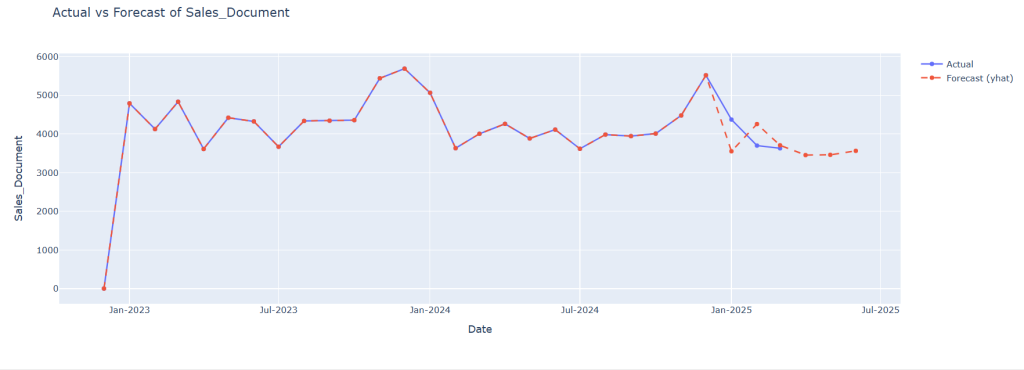
Pros: Prophet is great at capturing trends and recurring patterns. It “does a great job” finding seasonal cycles (like higher summer sales) and overall trends. Once your data is in the right format, it runs with just a few commands and produces clear charts like the one above. It’s also flexible (you can include custom events) and gives you both a forecast line and components of trend/seasonality.
Cons: Being automatic and smooth, Prophet might overshoot or undershoot sudden changes. For example, if your sales jump unexpectedly (due to a surprise hit or a one-time promo), Prophet might not predict that shift immediately. It’s also somewhat of a “black box” – fine-tuning it can be tricky, and it assumes future patterns will follow past trends. In practice, it works best when your sales history is stable and has clear yearly patterns.
Ideal for: Businesses that want fast, robust forecasts with minimal coding.
Want to explore Prophet in more detail? Check out its official website.
SARIMA (Statistical Seasonal ARIMA)
SARIMA is a classic statistical model that mathematicians have used for years. Think of it as a smart curve-fitting method: it looks at past sales and mathematically projects the pattern forward. The chart below shows SARIMA’s predictions (orange) along with a shaded band (yellow) that represents its confidence range. The blue line was the historical data used to train the model.
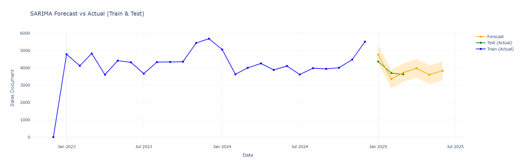
Pros: SARIMA is transparent and explainable. Many analysts like that it’s “easy to understand and interpret”. You decide how much weight to put on past months (lags) and seasonal cycles, so you can tweak it to your context. It’s also well-known for capturing both trend and seasonality when there’s enough data.
Cons: SARIMA can be time-consuming to set up. You usually need quite a bit of historical data (several years) to get reliable seasonal estimates. Choosing the right parameters (the lags for auto-correlation) is more of an art than a science, and if you pick wrong, forecasts can be off. It can also struggle if your sales pattern is very complex or changes abruptly – the model assumes the future is like the past. In short, it gives you control and clear math, but at the cost of needing more data and tuning.
Ideal for: Users who want transparency and interpretability in their simple forecasting models for sales.
Excel Seasonal Index (Spreadsheet Simplicity)
In the Excel chart, we’ve used two different forecasting methods to help understand future sales: the Forecast Estimate (purple line) and the Seasonalized Forecast (blue line).
The purple line is a simple trend-based forecast. It looks at how sales have increased or decreased over time and projects that trend into the future. This method is quick and useful when sales are relatively stable or don’t show strong seasonal changes.
The blue line, however, goes a step further by including seasonality. It starts by calculating a seasonal index for each month based on historical patterns—for example, if July sales are usually higher than average, this gets factored in. Then it removes seasonality to find the underlying trend, applies a trend forecast, and finally adds the seasonality back in. This seasonalized method is especially helpful for products like beer, where demand often peaks in certain months.
Comparing these two lines helps businesses decide whether a simple trend is enough, or if seasonal patterns must be included for more accurate planning.
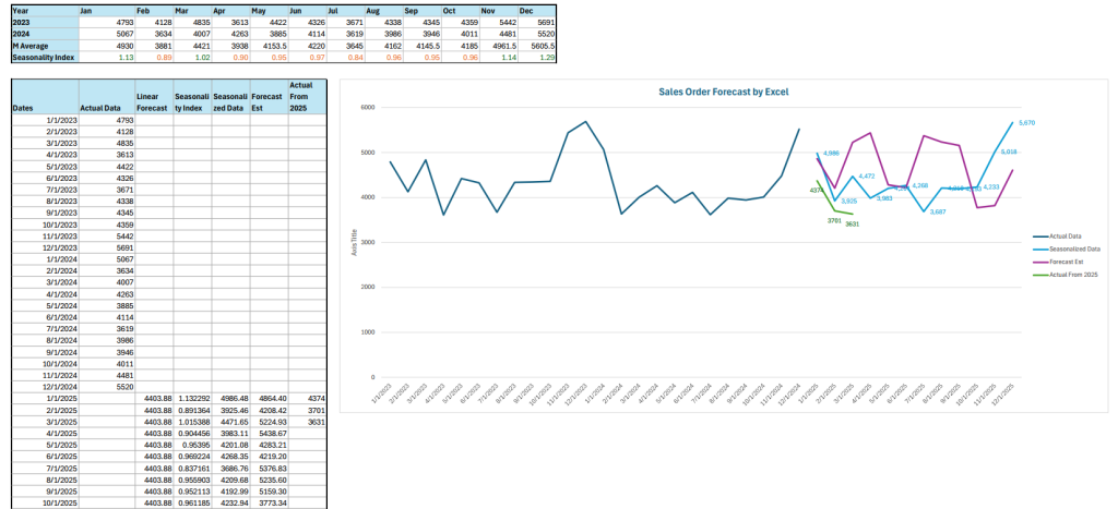
Pros: This method is very accessible – any manager who knows Excel can do it. It’s intuitive (take average sales by month over past years) and requires no special software. Many small businesses rely on it because it’s quick to set up and everyone trusts spreadsheets. It also forces you to think about seasonality explicitly.
Cons: Excel forecasting is quite basic. It assumes historical seasonal patterns repeat exactly and doesn’t automatically adjust for trends. If your overall sales are growing or if something changes this year, the static index won’t catch it unless you update it manually. Also, Excel doesn’t give you error bands (no yellow comfort zone like SARIMA), and as one consultant puts it, Excel “requires a lot of work to get your data ready. It can be prone to human error if data isn’t cleaned carefully.
Ideal for: Quick, straightforward forecasts and teams already comfortable with Excel.
Which Model is Best?
These simple forecasting models for sales can all work, but they have different strengths. The chart examples above give you a feel for how each forecasts: Prophet’s (red) line, SARIMA’s (orange) line with interval, and Excel’s (blue) line.
Best Accuracy: FB Prophet is the most accurate and robust for your sales data, especially for capturing both trend and seasonality.
Runner-up: SARIMA is a strong alternative, especially if you value having a confidence interval for risk management.
For Simplicity: Excel (Seasonalized Data) is best for quick, trend-focused insights but is less reliable for precise forecasting, especially in a dynamic market like beer sales.
| Model | Typical Gap to Actual | Strengths | Best Use Case |
|---|---|---|---|
| FB Prophet | < 5% | Captures trend & seasonality, robust | Strategic planning, reporting |
| SARIMA | 5 – 10% | Confidence intervals, interpretable | Scenario planning, risk management |
| Excel (Seasonalized) | 10 – 15%+ | Simple, quick, trend-focused | Initial analysis, trend detection |
Recommendations for Business
- Use Advanced Models for Planning: Rely on Prophet or SARIMA for critical forecasting needs-inventory, production, and sales planning-where accuracy matters most.
- Monitor & Update Regularly: Regularly refresh your simple forecasting models for sales as new data comes in. This keeps your forecasts in line with real-world changes.
- Use Excel for Quick Checks: The Excel approach is great for quick, high-level insights or when you need a fast, easy-to-understand forecast.
- Leverage Confidence Intervals: Use models like SARIMA that provide uncertainty bands to prepare for both upside and downside scenarios.
- Integrate Forecasts into Operations: Align your inventory, marketing, and logistics with forecasted demand to minimize stockouts and overstock.
What to Do When Models Disagree
It’s common for the three methods to give different numbers. They each see the data differently, so if Prophet predicts 5,500 for June, SARIMA says 4,700, and Excel says 4,900, what do you do? Here are some friendly tips:
- Compare their assumptions: One model might be catching a pattern the others missed. For example, Prophet might have seen a trend in increasing craft beer sales, while Excel (based on past months) is more conservative. If you know a trend or event was happening (like a local festival in June), see which model reflects that.
- Use business judgment: No method knows everything. If one forecast spikes on a month where you planned a big promotion (or a known holiday) and another does not, think about which is realistic. Your own market knowledge can guide which forecast seems more plausible for each month.
- Look at past accuracy: If you’ve kept track, see which model was usually closer to actuals during your test period. You might give a bit more weight to the more reliable model historically.
- Combine them: Often the simplest trick is to average the forecasts. This “ensemble” approach tends to be more stable. Instead of picking just one, take the midpoint of the three forecasts (or a weighted average if one model has proven better).
In Summary
For the manufacturing industry, where seasonality and demand spikes are common, advanced models like Prophet and SARIMA deliver the most reliable forecasts. Excel’s seasonalized approach is a good starting point, but may miss critical changes. Combining these insights ensures your business stays agile, data-driven, and ahead of the competition.